Hidden Homelessness Experiments
Forcing the public to overlook a campaign, to encourage them to pay attention to the overlooked issue of homelessness.
Colour
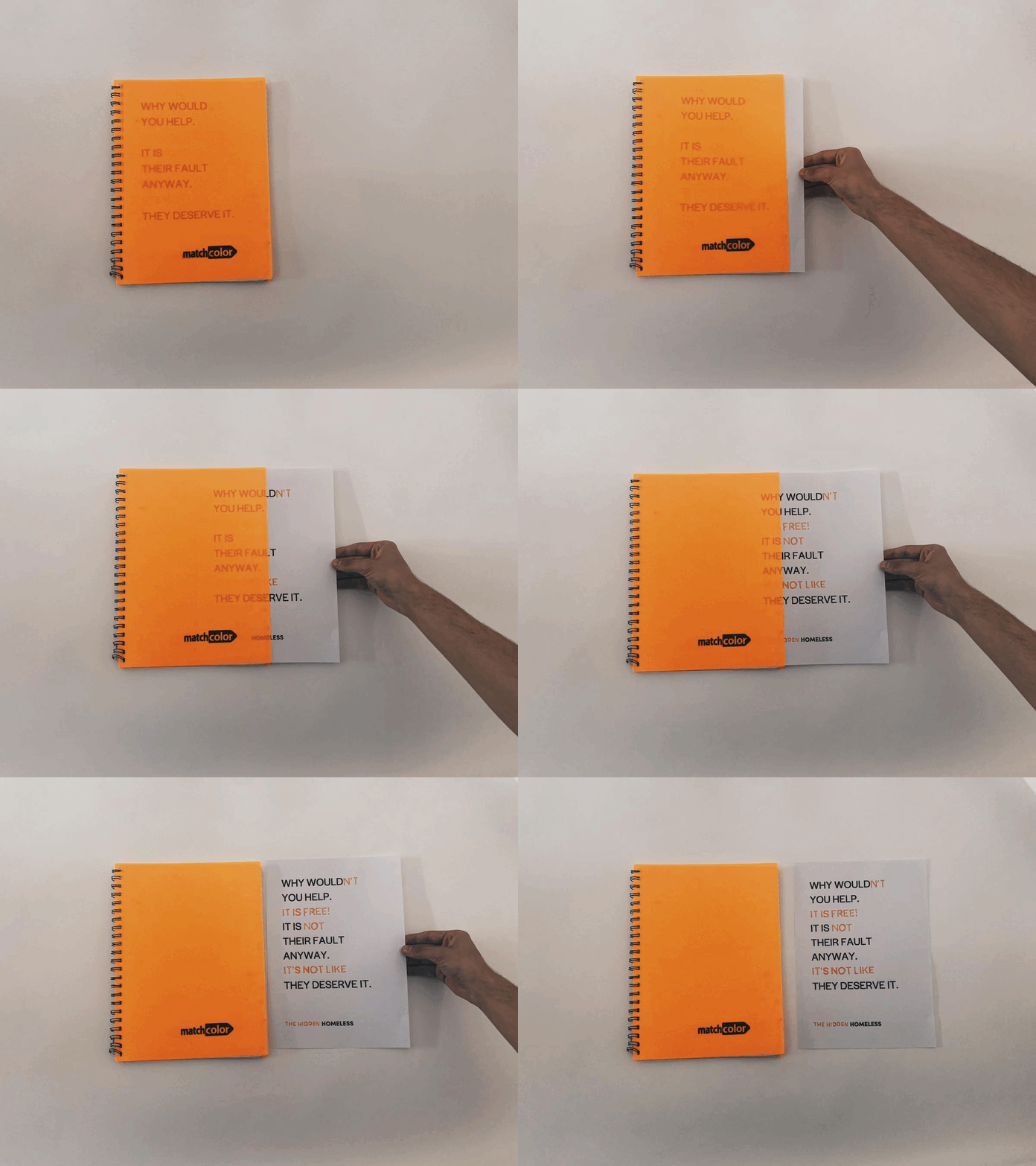
I first looked into how coloured filters can mask out certain other colours, hiding that information from sight. This is because usually we see things in white light, colours reflect their own colour and absorb all the rest. However, when the lighting changes (what the coloured plastic achieves) the object appears to have a different colour.
Perspective
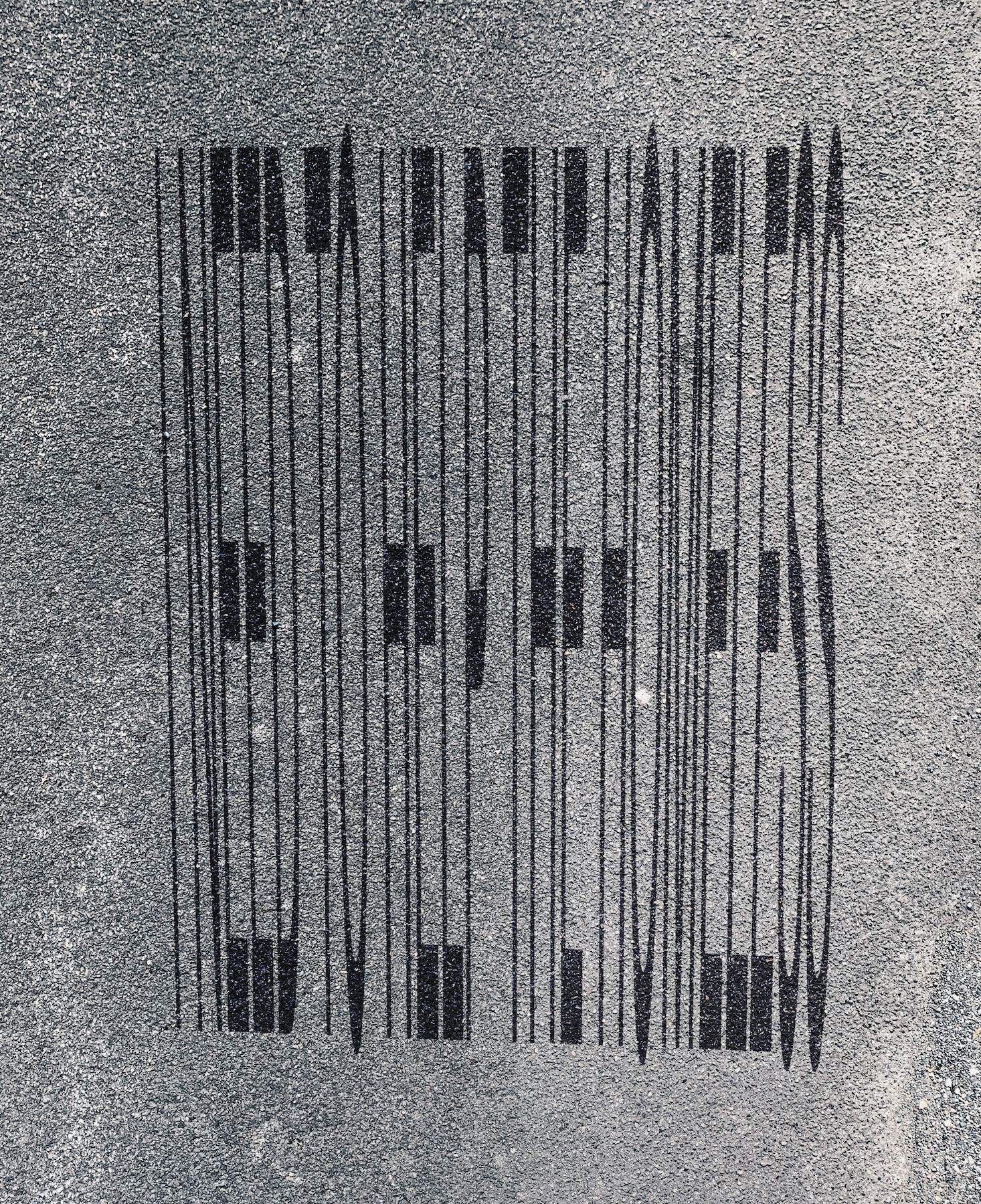
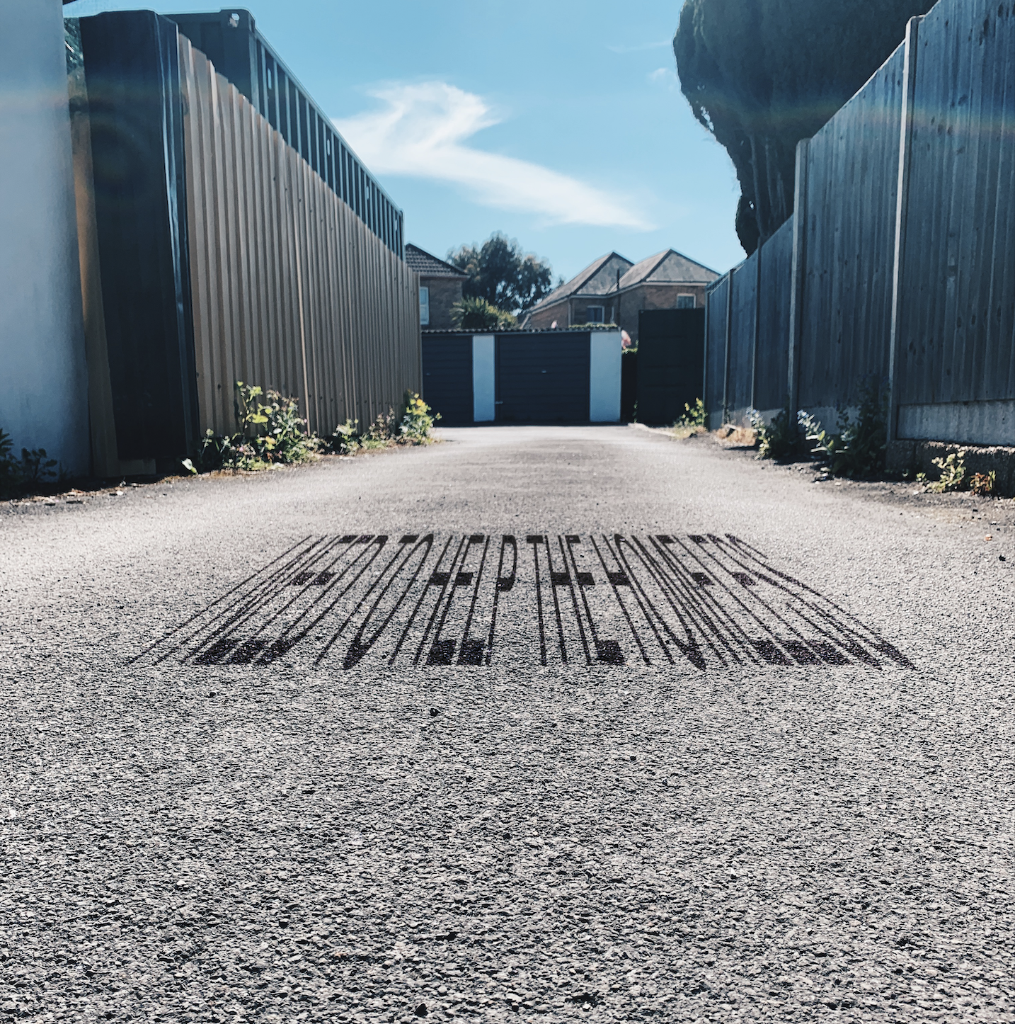
Another way to make people overlook my campaign is working with perspective. I liked the idea that the message would only be readable at a certain angle, one not everyone would see. Here I played around with writing with stretched text that is only legible from a low angle. I thought I could be clever with what I write here, linking the low angle viewers will go down to, to the angle homeless people lie in the street, as if they are seeing it from their perspective- both physically and metaphorically.
Hiding in plain sight
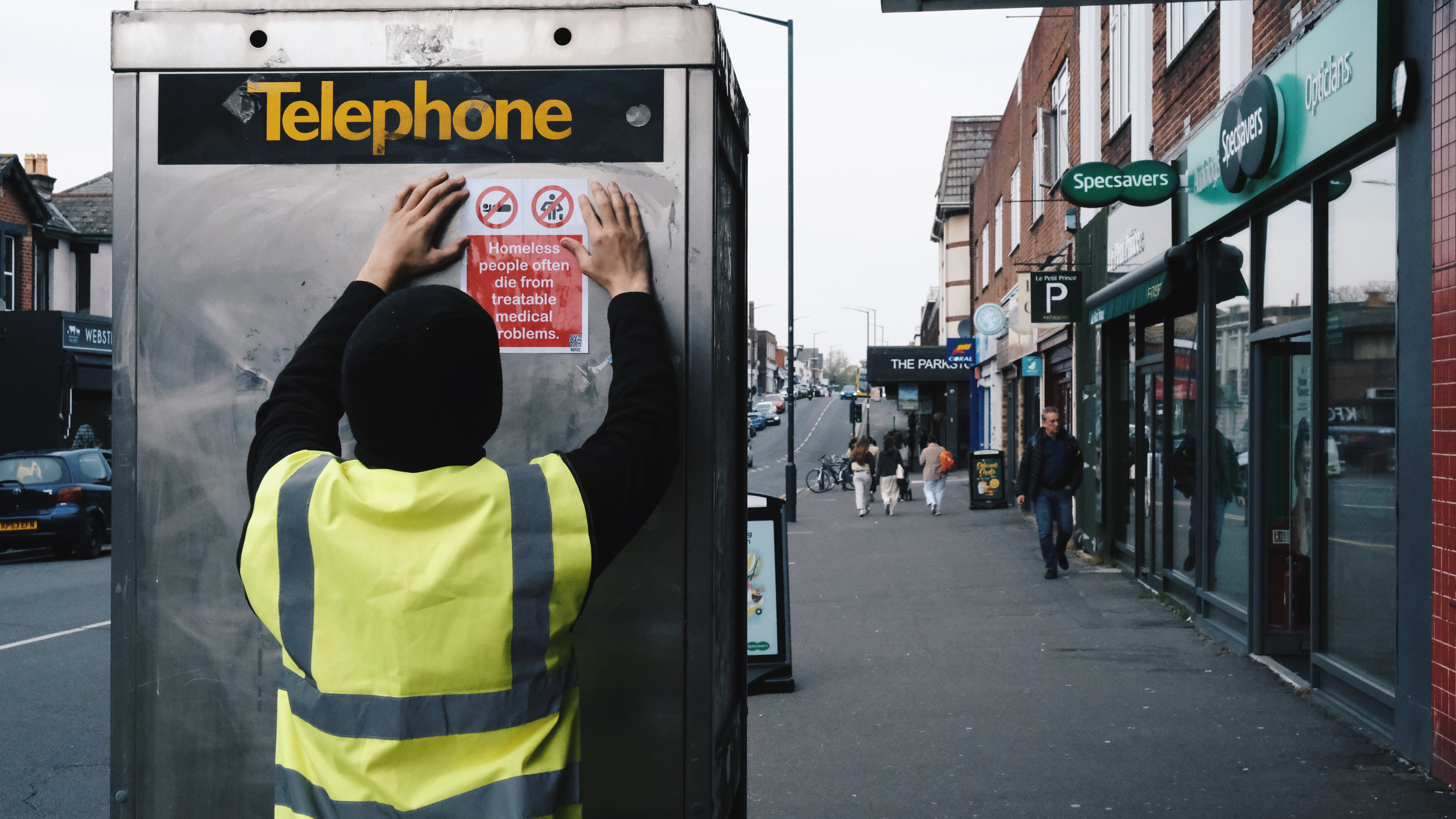
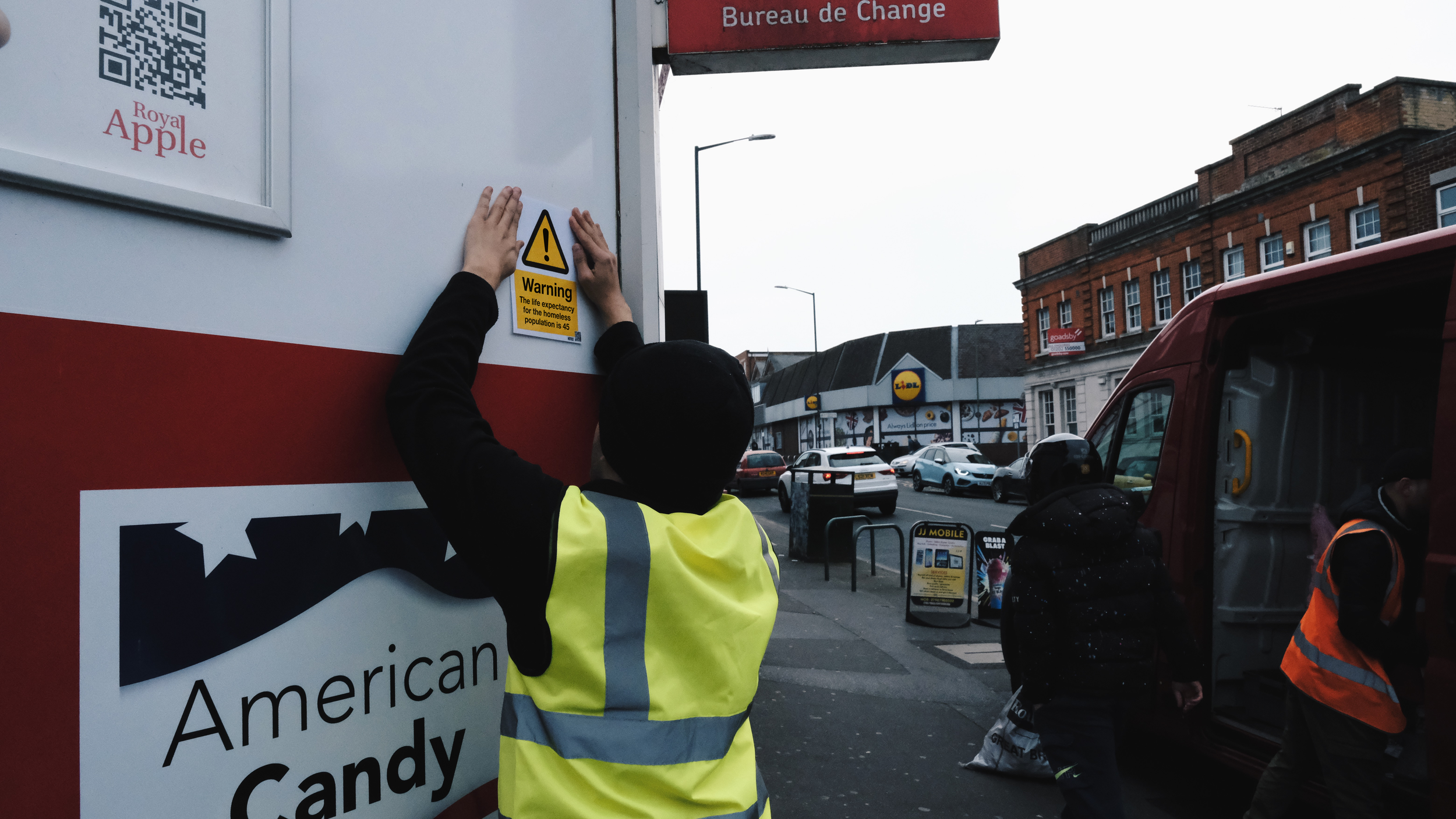
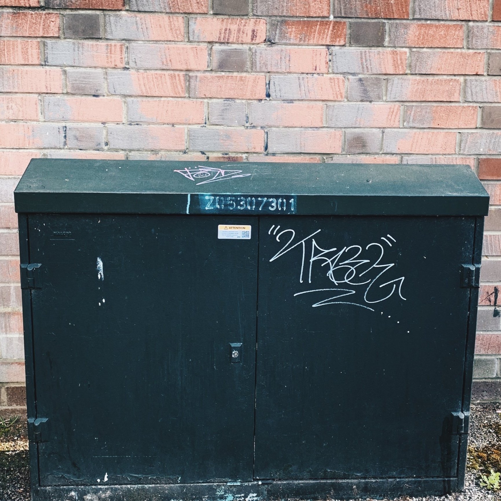
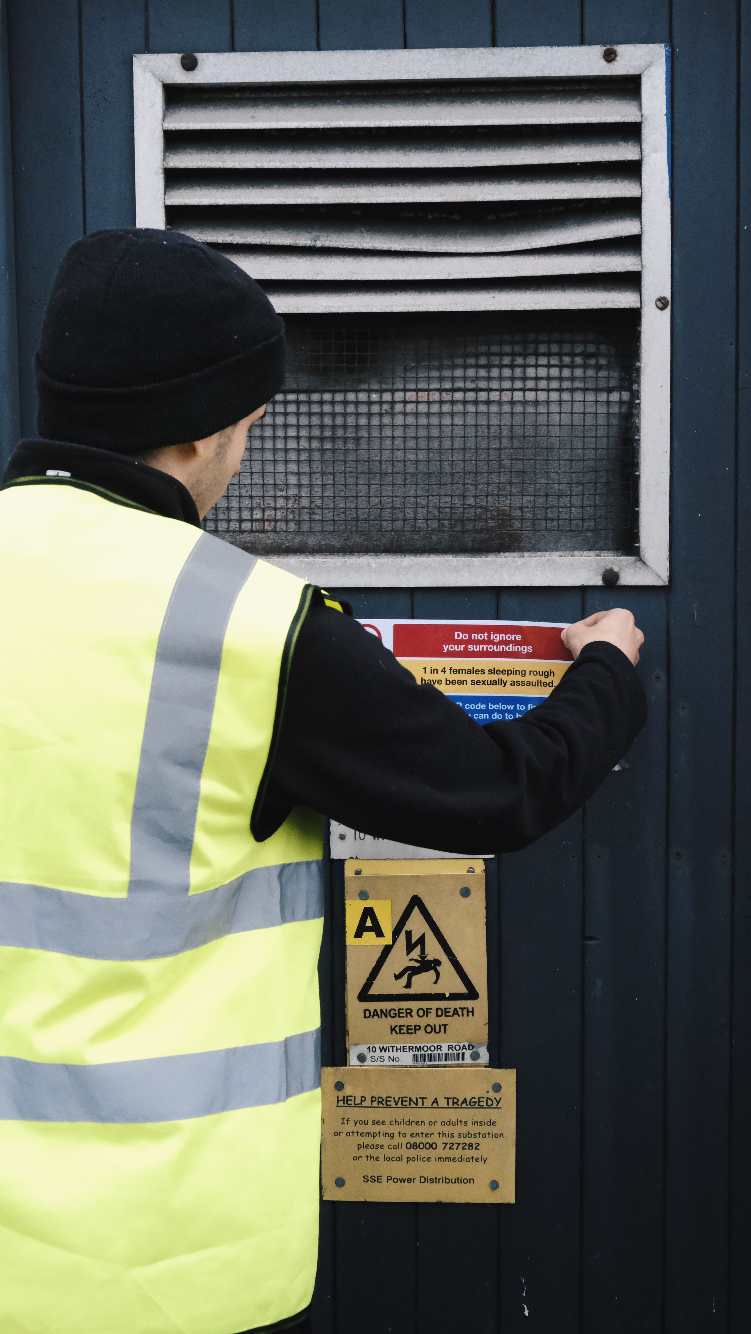
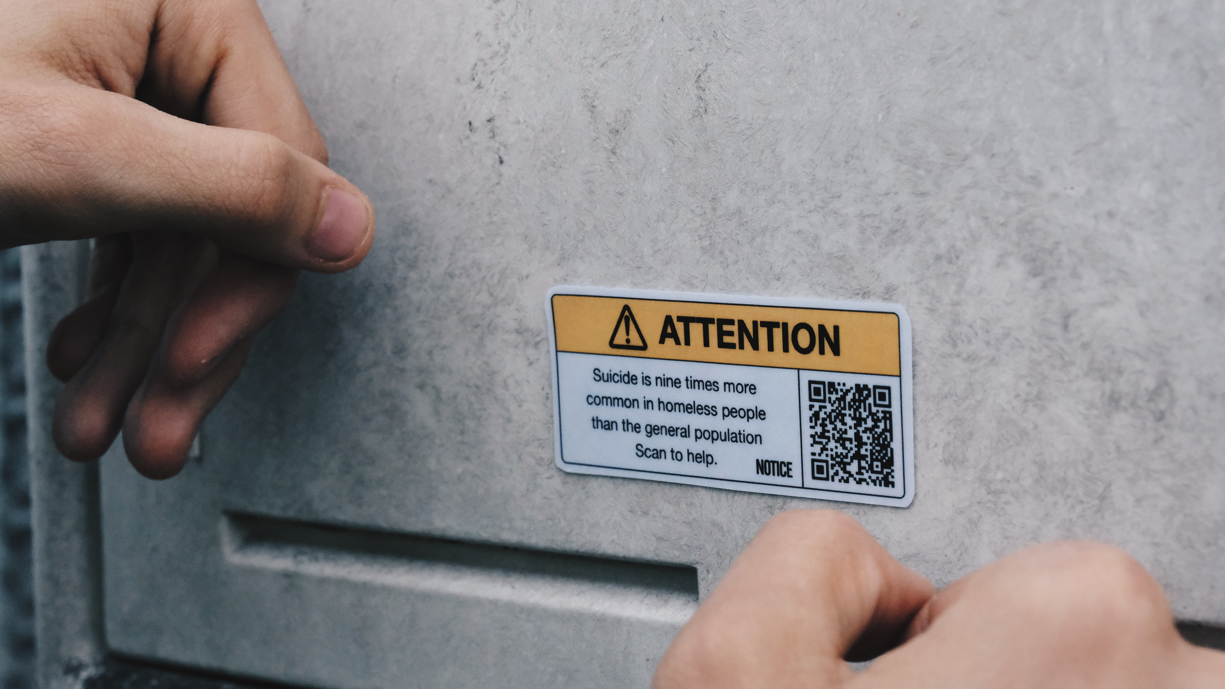
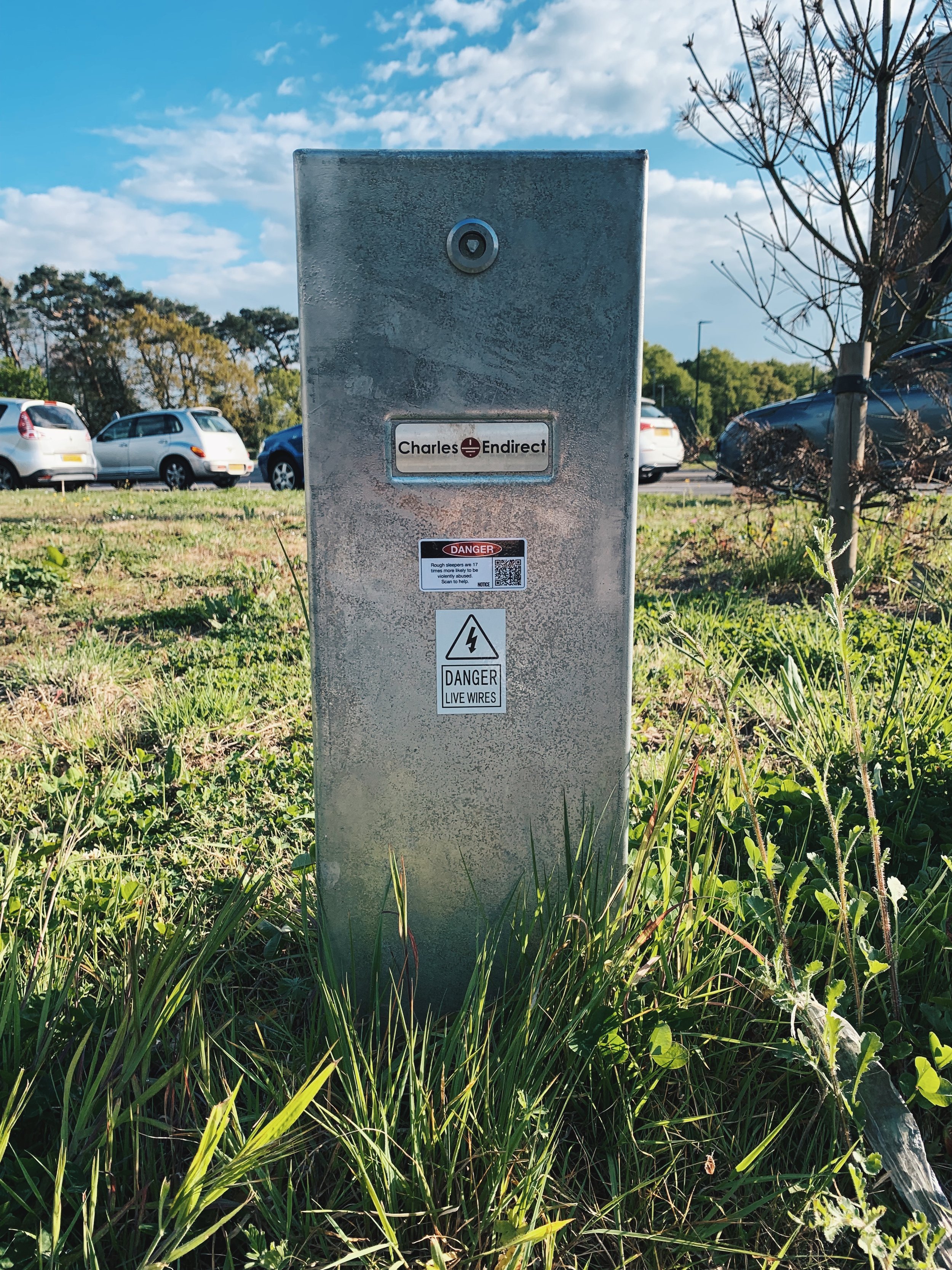
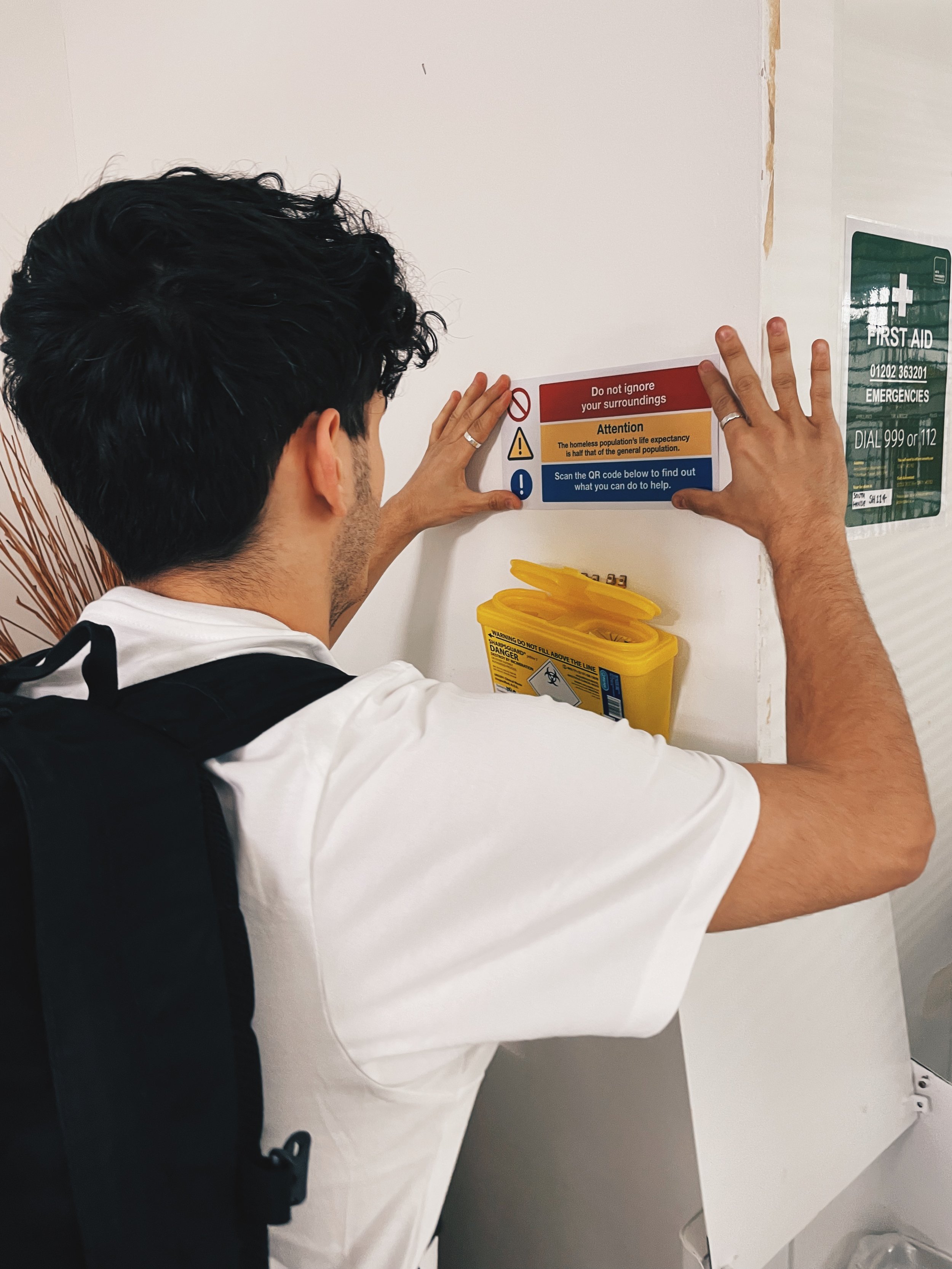
Hiding in plain sight uses no hiding techniques but trys to get no one to pay attention to my design. As attention is a limited resource, we can only focus on things that matter, meaning that there are so many things that we don’t pay attention to: often the boring things that remain constant in our life. This means that if I design something that looks like it should be there (and looks like somehting that was there previously) no one should notice. Below is the flicker paradigm, a experiment to show change blindness.


Graphic clone
I spent months paying attention to posters, signs and stickers that I had overlooked previously, and then went on to produce designs that would blend in- making the public overlook the campaign. I then got these signs printed and installed over 30 of them all around the UK including Bournemouth and London.
